Featured
Creating an agile brand expression
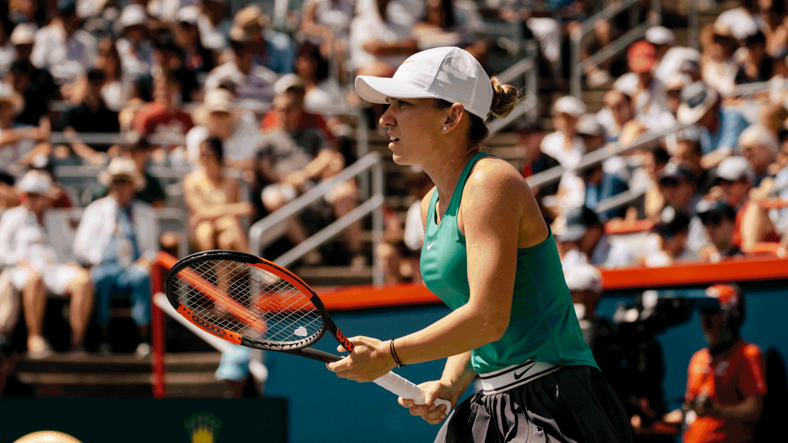
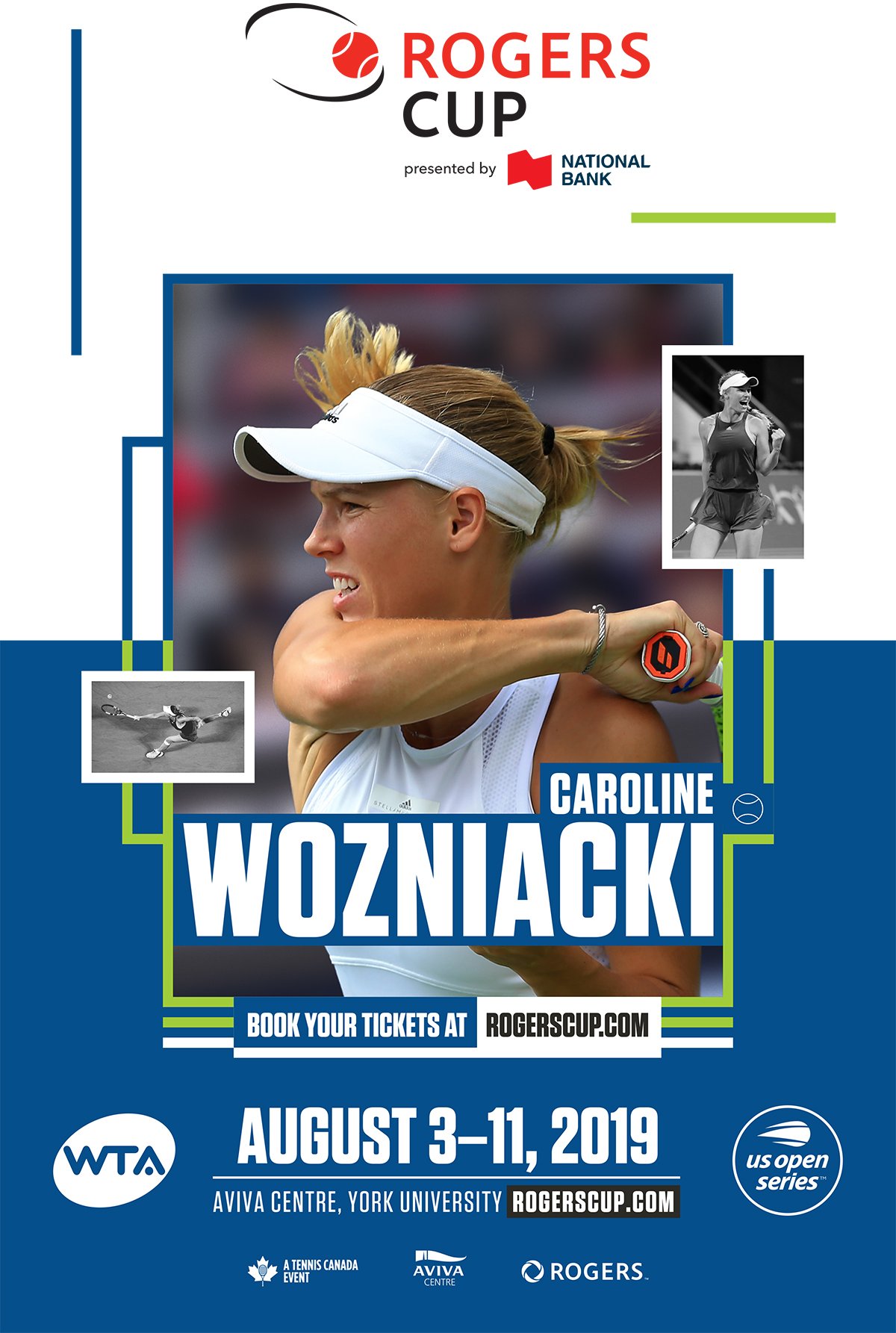
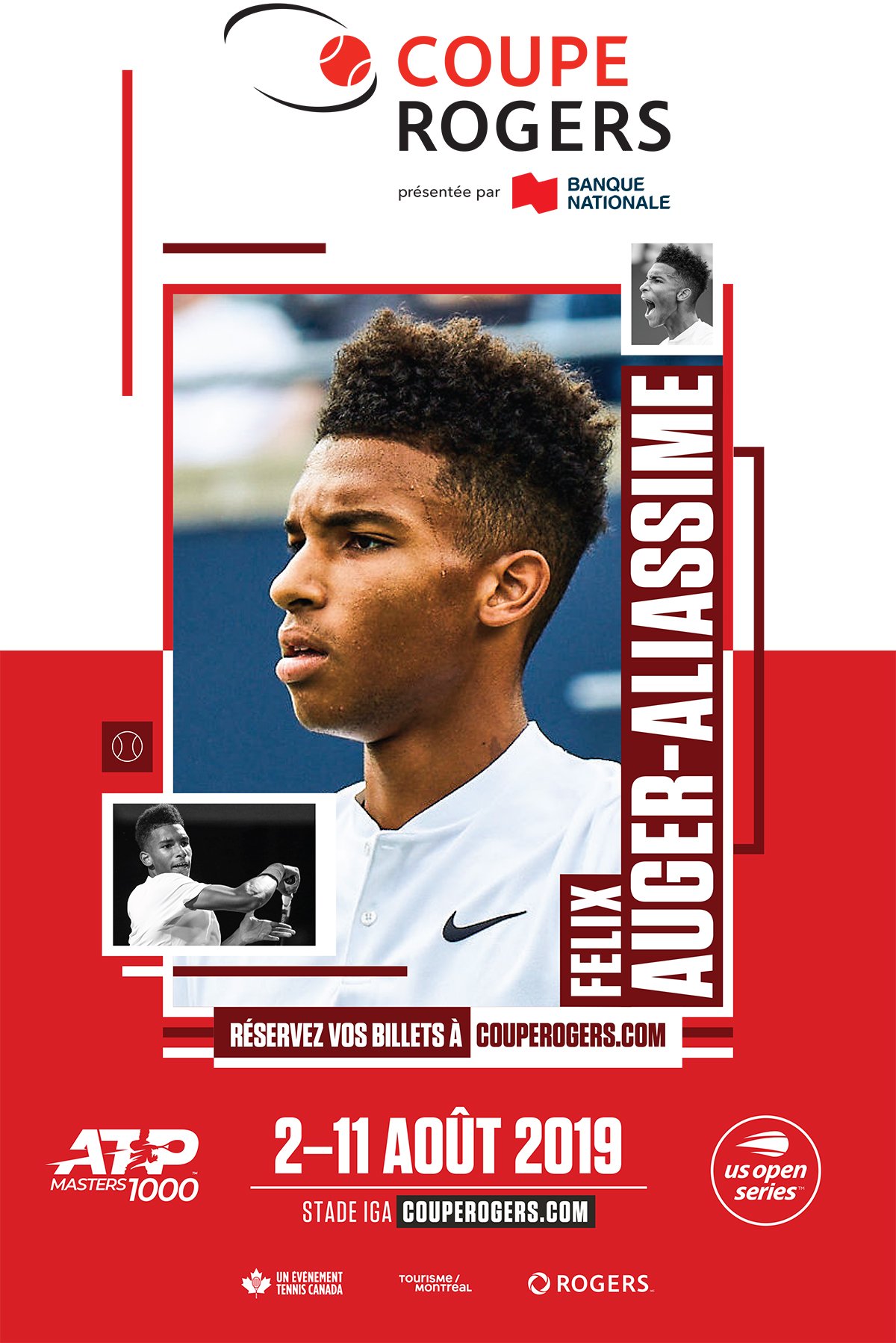
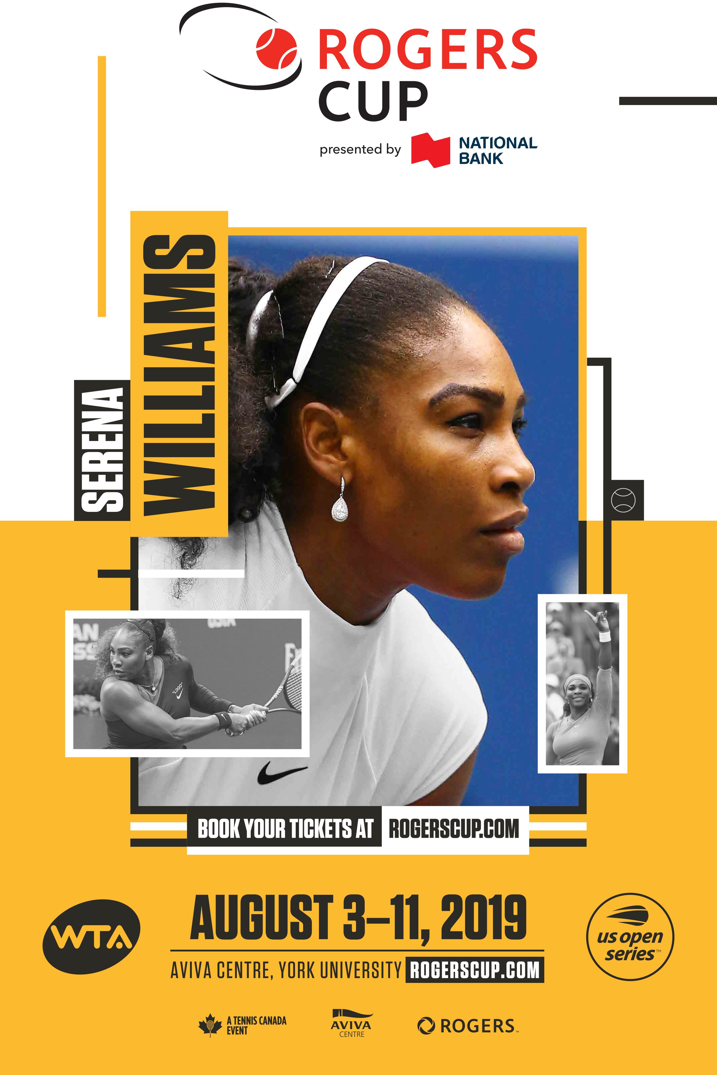
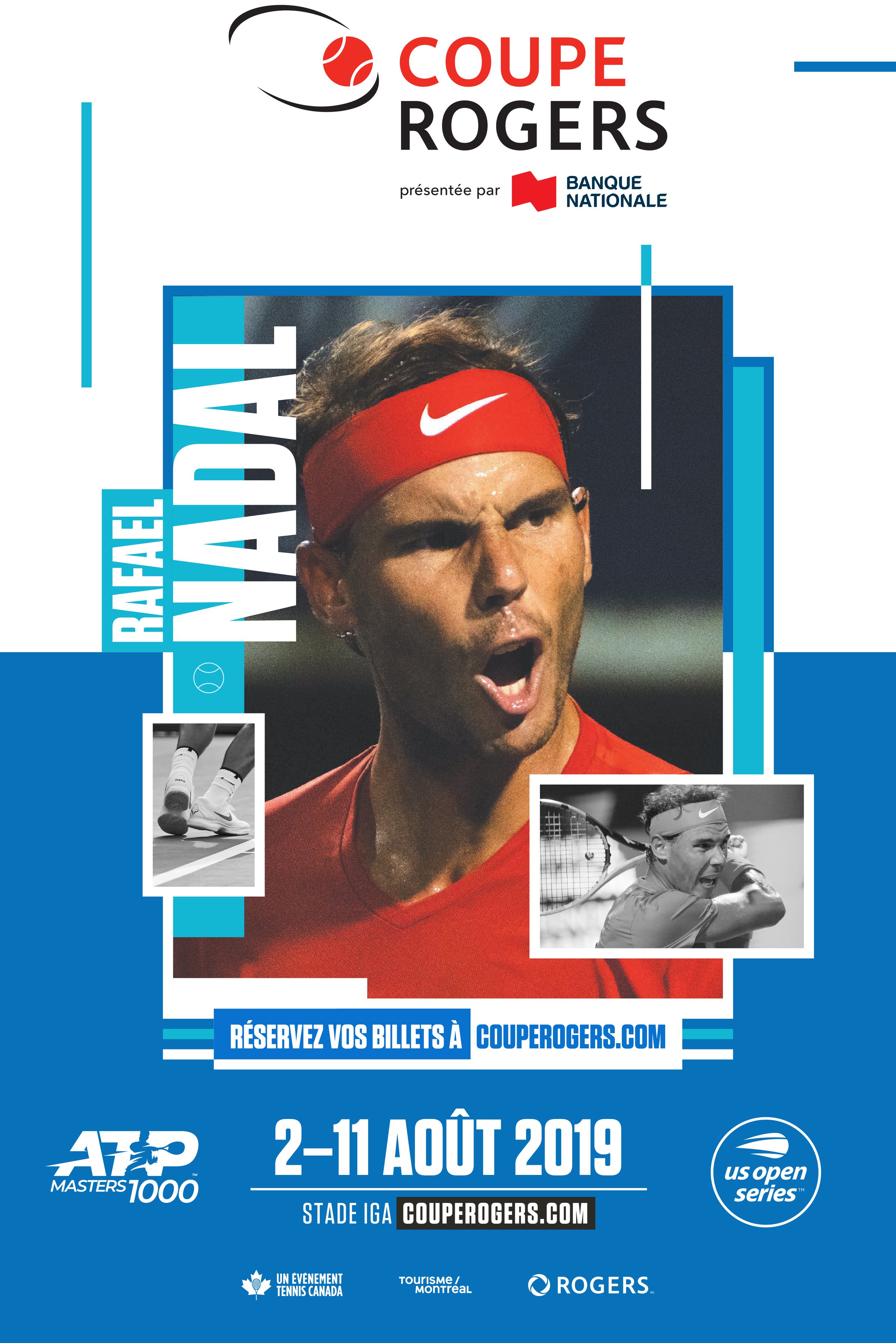
The problem: Rogers Cup, the premier Tennis Canada tournament, has long suffered from an identity crisis with its branding material. From last-minute player changes to multiple partners using the branding material to overly complicated creative, consistency and efficiency were needed.
The solution: A simple brand identity based on a deconstructed tennis court. With the court's recognizable shapes becoming containers for visuals, we gave the brand the framework it needed before layering on original photography, bold typography and bright colours.
DESIGN
DECONSTRUCTED COURT: Taking cues from the court we were able to create a robust and agile design system highlighting players, names and relevant communications.